Contabulation

For a long while, I’ve felt that the design of iOS is too top heavy. While our phones seem to grow larger every year, our hands do not and so interface elements are pulled ever further out of reach. It’s a real micro-annoyance to have to shuffle your phone around in your hand to reach the top of the screen to activate a search bar, shuffle your phone back down so you can type comfortably and in doing so you accidentally touch part of the screen that deactivates the search field and you have to start again.
Accommodations have been made for our larger phones. Reachability lets you momentarily shift the contents of the screen down, but it can be prone to causing accidental input and has gotten harder to activate as it conflicts with the Type-to-Siri gesture. Swiping from the left edge to navigate backwards is near ubiquitous, but implementing the more comfortable “sloppy swiping” that lets you navigate by swiping anywhere on screen is a pain to implement, and can lead to bugs where navigation state gets conflicted.
Working on Obscura highlighted the importance of keeping all an app’s most important controls within easy reach, as having to adjust your grip or use a second hand to tweak a setting can cost you a photo opportunity. While a camera app is quite a unique use case, I think the principle that the most important actions of your app should be the easiest to reach is universal. When I consulted on Casey Liss’s Callsheet, I insisted that he put the search bar at the bottom, as it’s the element that almost every user is going to use almost every time they open the app. While Casey was reluctant at first, because it’s a lot more work to implement a custom search field at the bottom of the screen than to use the default system one at the top of the screen, attached to a Navigation Bar, he was convinced after trying it out, and the customer response was emphatically positive.
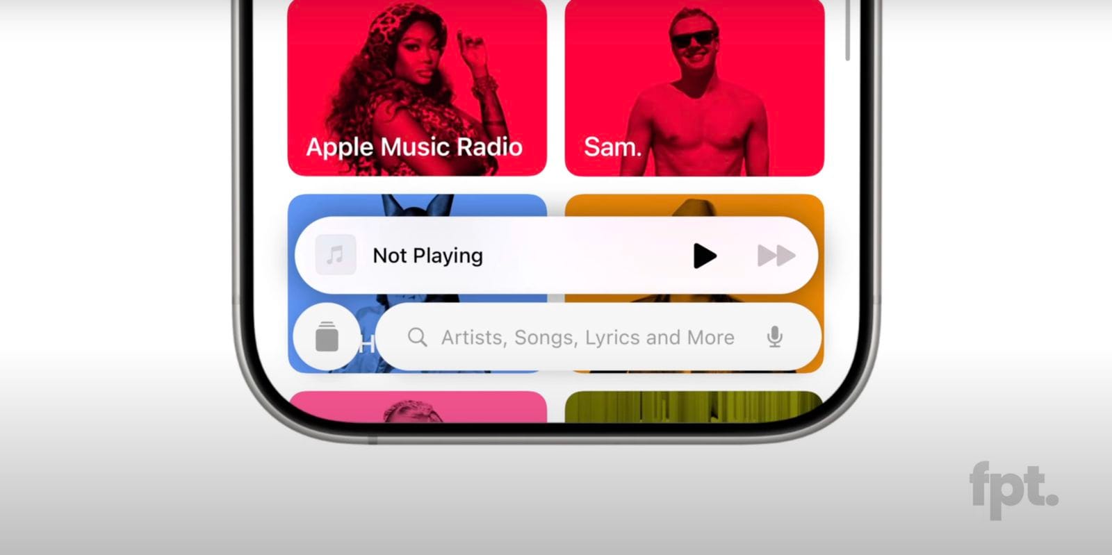
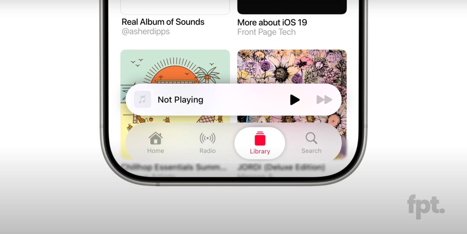
If search is the primary form of navigation, as in Safari, Maps, or Callsheet, it should be at the bottom. If a search bar is just used for filtering content already on screen, then it can make more sense to leave it at the top, as scrolling is probably the more natural way to find what you’re looking for (the Settings app is a good example of this). So I’m delighted at the rumours that iOS 19’s Tab Bars can adapt into Search Bars when needed. I think it’ll be big improvement and allow for more flexible navigation patterns with less code.
But my frustrations with navigation on iOS and Tab Bars in particular go further than that, so here are a few things I hope to see improved:
Support for Actions & Context Menus
Tab Bars have been around since iPhoneOS 1 and have evolved shockingly little since then, even as apps grow ever more complex. Allowing Tab Bars to do more than just switch tabs would create opportunities for more complex navigation and interaction without sacrificing screen real estate, and do so in a consistent and predicable way for users.
Currently Tab Bars can only switch tabs, and require workarounds to perform common actions like showing a sheet to compose a new email.
For example, a social media client could have a New Post button that lets you long press to open your drafts or a Profile tab could show a menu showing all your accounts letting you quickly switch between them.
Toolbars behave similarly to Tab Bars and allow for actions and menus but you can’t mix and match TabItems and ToolbarItems, limiting the behaviour of these bars.
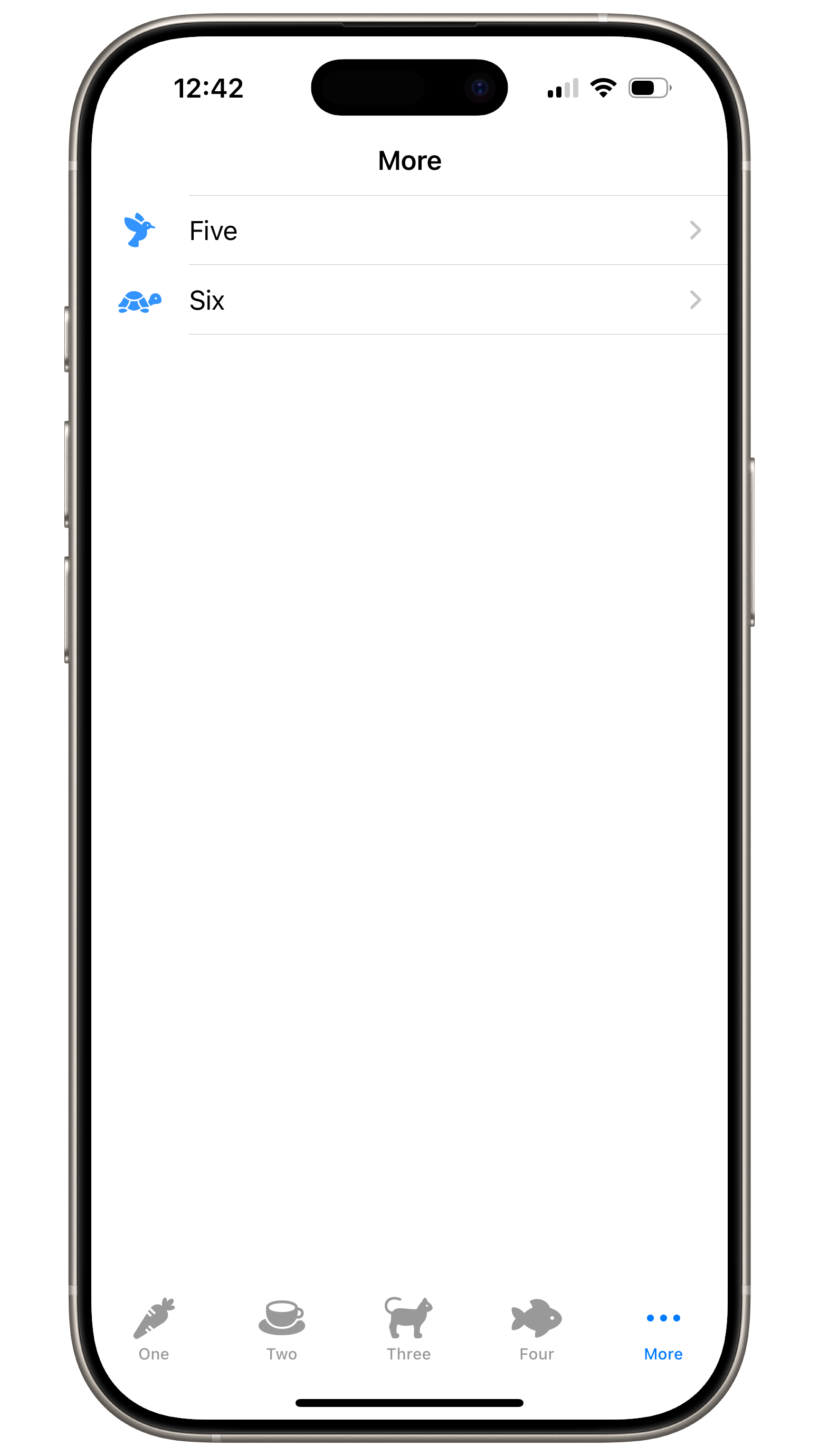
Support for More Tabs
Right now, Tab Bars support up to 5 items. Once you add a sixth, the fifth button gets replaced with a generic More button and tapping it shows a generic UIKit/SwiftUI List with the overflow. This overflow list can’t be customised (in SwiftUI at least, as it exists entirely within the Tab Bar’s implementation) and so looks incongruous to any app with a bespoke appearance.
A very quick and easy solution would be to just use a context menu for the overflow items; that would at least keep things within easy reach and there wouldn’t be a concern about style conflicts. But I’d really love to see a more novel approach. Tab Bars on iOS are supposed to be interchangeable with Sidebars on iPadOS (and macOS) but sidebars naturally support any number of items, with collapsible sections, so you either optimise for 5 tabs, and limit the possible sidebar items, or deal with the overflow. Scrolling tab bars are one option, showing partial sidebars that don’t cover the whole screen (hamburger menus) is another.
User Generated Tabs
So far I’ve been discussing tabs as a way of navigation between different views of the app created by the developer, but I haven’t mentioned tabs like how we think of them in a browser. On macOS, document based apps (think apps like Pages or Numbers) can display tabs for a number of open documents on screen, letting you quickly switch between them. (I think this used to also be the case on iPadOS but isn’t any longer??). And switching between tabs is a great navigation pattern. A Wikipedia app could let you keep multiple pages open at once, quickly switching between them without losing your place.
It’s baffling to me that there’s no system provided solution to this and as a result, so many iOS apps consist of going back and forth between lists and detail views, up and down the navigation stack, when lateral navigation would be more efficient.
I built a simple version of this for my app Ketchup, and while it doesn’t do everything I’d like (save scroll position, for example) it does let you quickly switch between recent pages, saving you time as you cross reference information.
Ultimately, I think the simplicity of Tab Bars as they exist today don’t account for the complexities of modern apps. I’m hoping the iOS 19 changes allow for much more flexibility and opportunities to experiment. I guess we’ll find out in June.