Freckle

I’ve had the idea of a Polka Dot generator app sitting in my list of app ideas for a number of years. After spending the last year working on Obscura 4, I felt like I could with a little break to work on something lower stakes. Thinking over the idea, I came up with the name Freckle, it felt it was too perfect a name to let go to waste.
I started putting together a few mockups in Sketch and more concrete ideas began to solidify.
Layout
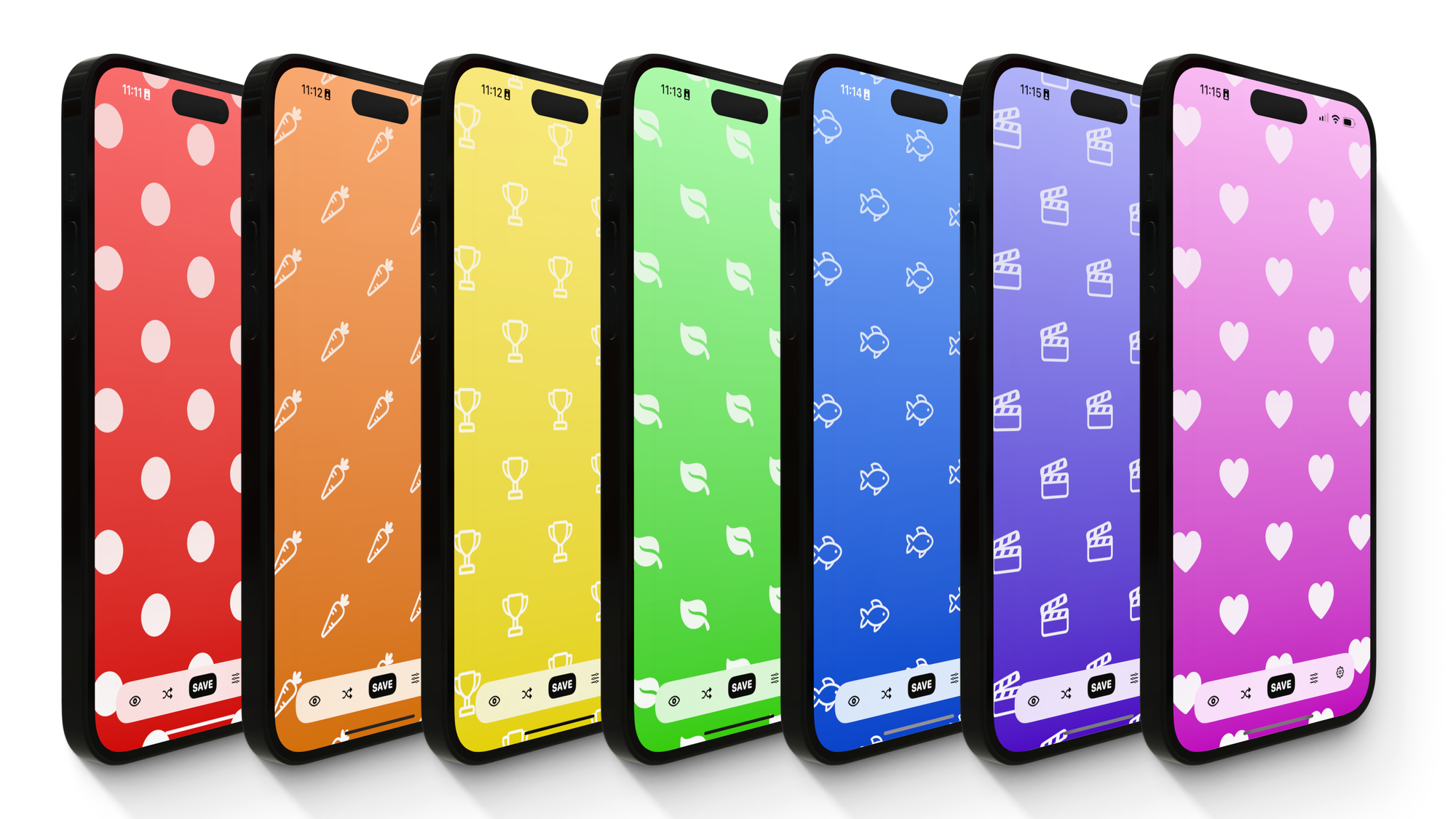
I knew from the get-go that I wanted to offer a few different layouts for the polka-dots themselves. It’s an issue though, that not many geometric shapes tesselate (fit together without gaps), so I settled on just doing squares and hexagons. I also wanted to have a fun animation between the different patterns, which meant coming up with a non-obvious way of laying out the dots.

Controls
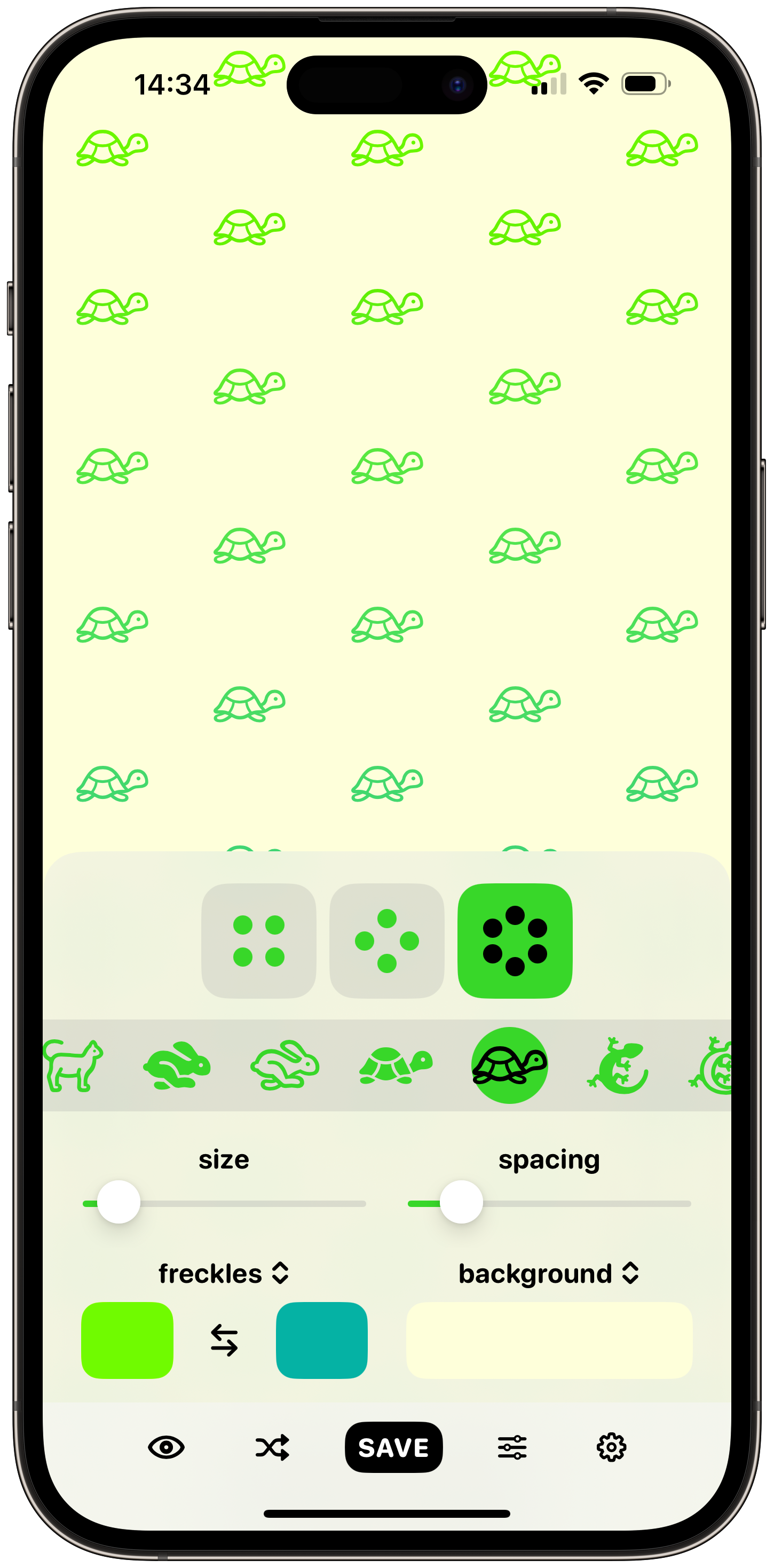
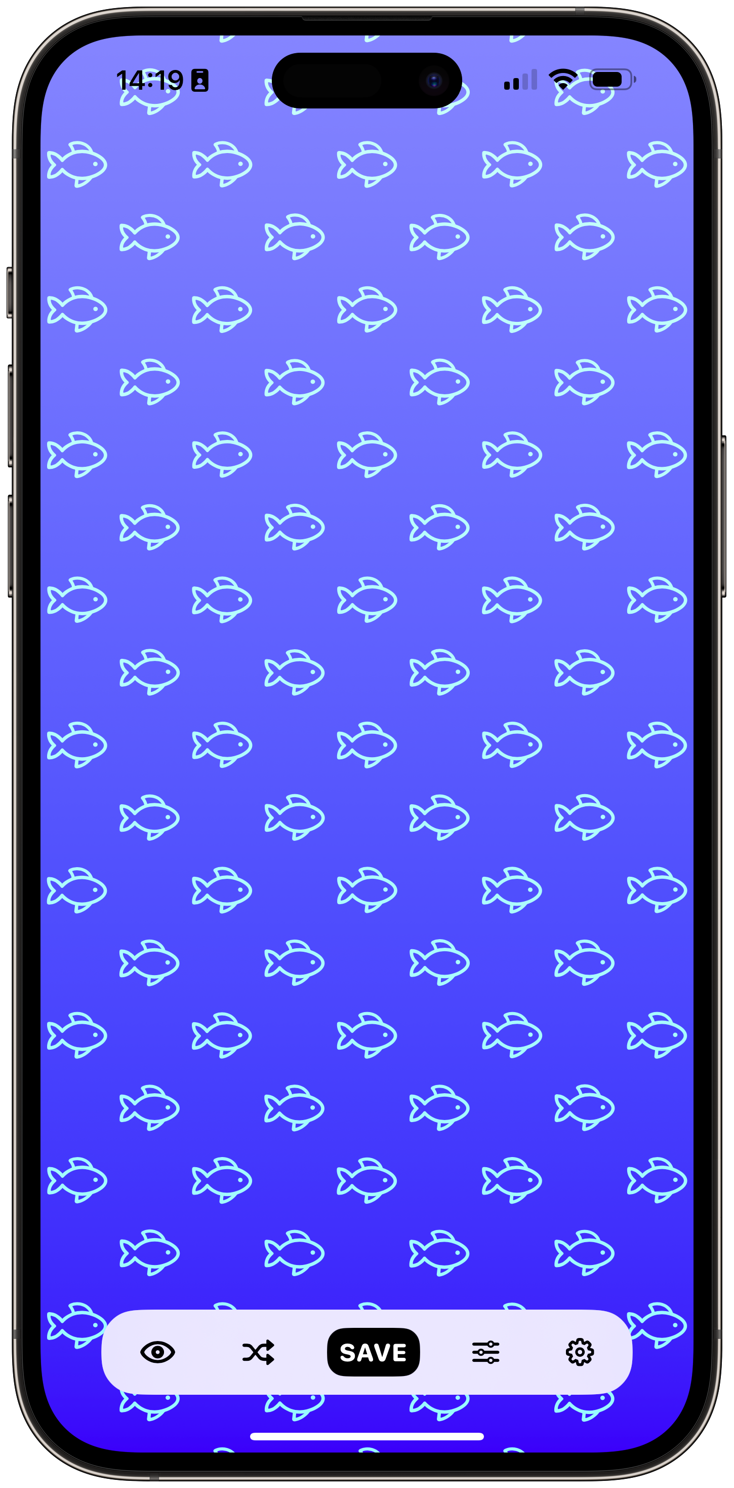
One of the issues faced by any app designed around a canvas is that unless you’re dealing with a very large screen, the canvas will be obscured by the UI. I realised that I’d already solved a similar problem in Obscura when building the image viewer. Since covering the canvas is unavoidable, the goal was to create controls that take up as little space as possible, and are easy to hide quickly. It took a few iterations to simply and condense the controls to the point that they felt sufficiently unobtrusive. I also added a “preview” button that would hide all the controls when held down.
Shuffle
One of the first features I came up with was the ability to shuffle the wallpaper colours. Polka-dots generally have a whimsical vibe, and adding a little randomness will hopefully add some surprise and delight to the experience. It also serves as a good way to showcase some of the possible styles you can achieve by purchasing Freckle+ and choosing your own colours.

Icons
I had the idea early on that it would be fun to offer a few geometric shapes for the polka-dots, like squares or hearts. But when I realised that I could instead use SF Symbols, and take advantage of a wide range of icons, I overhauled how the dots were drawn. I think the range of symbols offered makes the app a whole lot more entertaining. You can set up unique patterns to pair with different focus modes for example, or just have a hundred little fish on your lock screen if you prefer.
Monetisation
It was tricky to balance when features should be offered for free and what should require purchase, given just how simple the app is. Eventually I decided to gate the icon picker and the ability to choose colours manually. This meant that users could get a taste of the possibilities using the shuffle button, but customisation and control would be limited.
Freckle+ is a one-time purchase of $2.99.
So that’s Freckle. I hope it’s as fun for you to use as it was for me to build.
