I Bought an iPad mini

I didn’t want to, but it happened.
It’s been a while since I last bought a new iPad (a 2018 12.9" iPad Pro). The iPad is a really fascinating device, in many ways the most capable device Apple makes, and in others, the most lacking.
That 2018 iPad is starting to get a little long in the tooth. Despite feeling overpowered when it was new, time and iPadOS updates have left it feeling a little sluggish, the battery is in poor shape, and its gorgeous OLED display is starting to yellow around the edges (the same is happening to our 2018 LG TV, so I’m feeling a little less enamoured with OLED these days).
The device I really wanted to upgrade to is the 2024 11" iPad Pro (€1229). I got to play around with Chris Lawley’s at WWDC this year, and was instantly smitten by the display, which made everything look like a high quality printed magazine. The downside is, to get the nano texture option, you need to buy an iPad with at least 1TB of storage (€1959). The nano texture display itself brings that up to €2089. If I’m spending that amount of money on an iPad, I want it to last a good few years. And if I want it to last a good few years, I think I want to add the cellular capability, because it will almost certainly come in handy at some point, right? €2339.
Oh, don’t forget, there’s a new Apple Pencil (€149) and I’ll need a cover (€89) to keep it safe. €2577.
Did I mention that the iPad doesn’t run Xcode or Sketch, the two apps I spend the vast majority of my working time in?
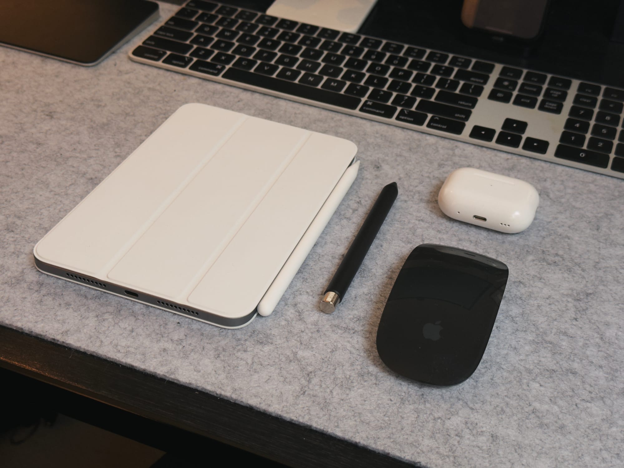
So I closed the tab and bought an iPad mini (256GB), with a pencil and cover for €967. Still feels like too much, but a lot more in line with the value I’m likely to get out of this thing.
Okay but is the iPad mini any good?
Yeah, it rocks. It’s such a delightful little bundle of technology.
I spent a good chunk of both Saturday and Sunday out taking photos of autumnal nature, and then editing photos on the iPad in the evening. Darkroom runs pretty well on it (it seemed to occasionally struggle with iCloud Photo Library changes), and working on a display larger than my phone, but small enough that it didn’t feel like work made for a really nice experience.
The Apple Pencil Pro is a nice upgrade. The hover effects really make these devices feel like they’re made for each other.
It is the perfect size of device for playing Balatro while you watch TV in the evening. This is a very important quality to have.
The Downsides:
I really wanted to buy a silver iPad. My laptop is silver, my Mac Studio and Studio display are silver, my Apple Watch is silver. I know a lot of people want more colourful devices, I just want mine to match. It’s baffling that Apple never seems to get all their product lines aligned in this. I absolutely love the white cover, though I expect it won’t age all that gracefully. Also, the margins on these smart covers must be absurd. I’m a sucker, I know.
I’m very aware of the screen’s refresh rate. I’m not sure why it stands out to me more than on my Mac’s display, but it does (I guess iOS has a lot more animations?). It’s far from a dealbreaker, but I think this has pushed me into the camp that it’s time for higher refresh rates across Apple’s entire lineup. Thankfully jelly scrolling is not an issue. (I remain curious as to why it’s not referred to as Jello Scrolling in the US.)
Going back to TouchID feels like a real shame. I know it has its fans, but FaceID is far more reliable for me, and feels 100× more natural on the iPad. A big thumbs down here. The upcoming iPhone SE is expected to have FaceID and cost about as much as the iPad mini, just saying.
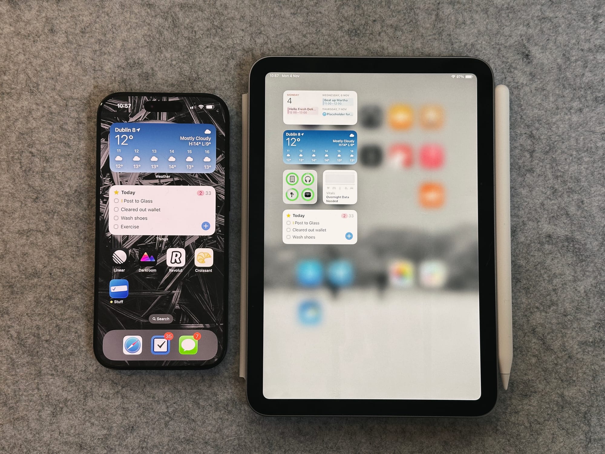
Widgets on the Home Screen feel comically small, they’re significantly smaller than on my phone. A medium widget on the iPhone takes the space of eight app icons. On the iPad, the same widget takes up two icon spaces. The same proportions are used across all iPads, but this feels boneheaded. The widget sidebar is an even worse offender though, as the widgets only take up half the screen. It feels ridiculous. And I have very good eyesight. If features like Stage Manager are going to be limited to larger iPads, then you have to put in the effort to optimise each device’s layout.

Taking a screenshot with all the buttons on the same edge feels surprisingly awkward. I’ve had to brace the iPad against my chest or use a second hand quite a few times. It’s not a big deal, but it’s something I never would have considered before running into it myself.
The list of downsides seems longer because they’re a lot easier to write about, but don’t get the wrong impression, the iPad mini already feels like a really great addition to my life. I’m looking forward to using it more and more.
Also they should make the iPad Pro cheaper.
