Indigo’s Design Evolution

Talking about iterative design is tricky; show every step along the way would be overwhelming and not terribly interesting, but showing just the start and end points obfuscates the amount of work and exploration that went into it. A lot of the work looks like this:
And that gets tiresome really quickly. So I thought I’d focus on some of the pivotal moments of Indigo’s design to show how we got here.
Skylark
Way, way back in 2023, I put together a very basic prototype of a Bluesky client that I called Skylark. I didn’t get much beyond the ability to display a few posts on the timeline, but you can already see a number of elements that carry through to Indigo today.
Floating Tab Bars are something I’ve been implementing long before Liquid Glass first appeared, as I think they make an app feel much less rigid and create a more open feel, much like good use of whitespace in a typographic layout. You can also see the prominent Plus Button, to start a new post, and the chevron next to the Timeline Button, indicating that it can be expended.
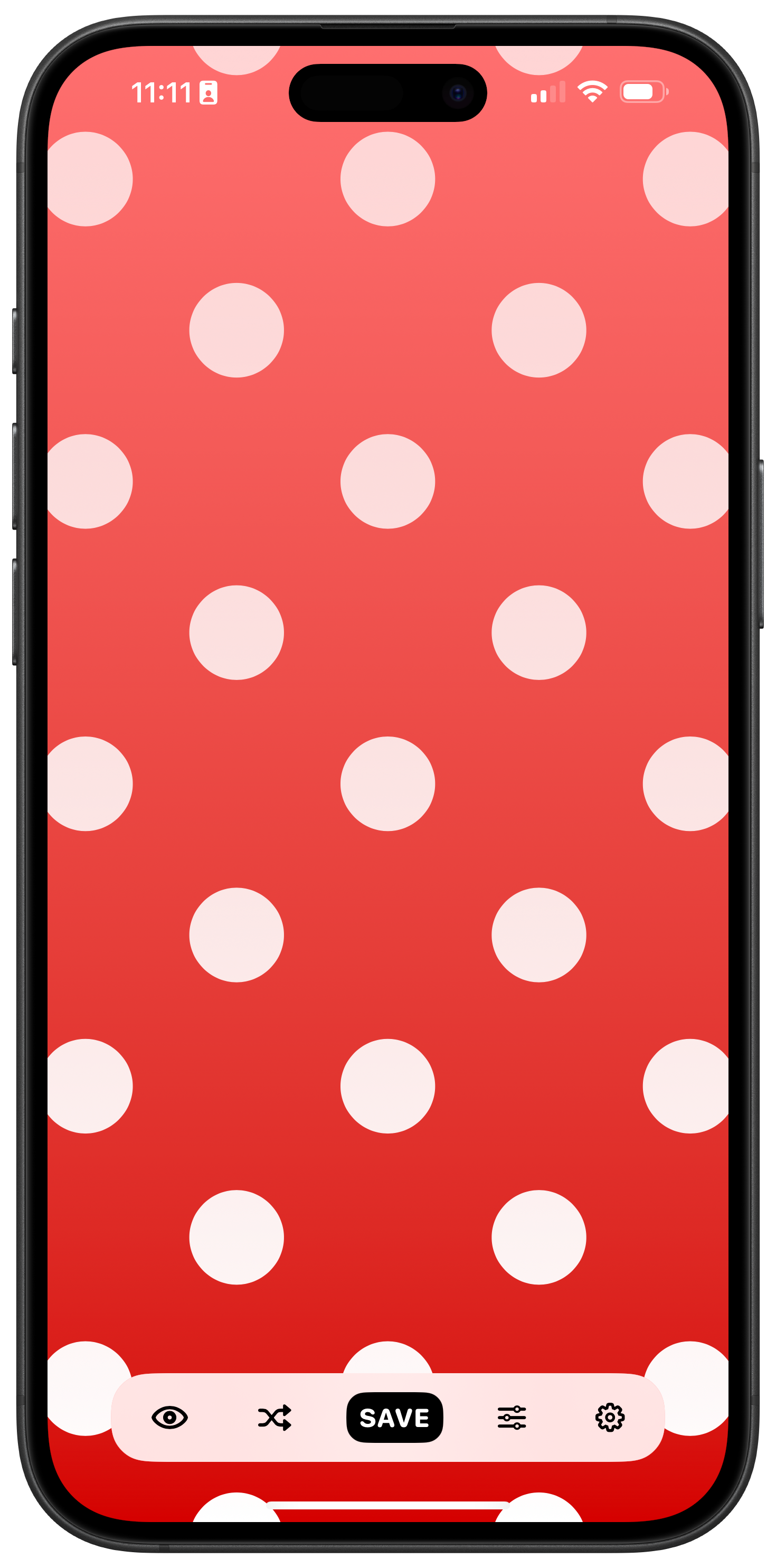
The floating tab bars I built for Obscura 4 and Freckle
But I quickly realised that building an entire social app by myself was probably a fool’s errand. And that was that, until Aaron entered the picture. There’s not a whole lot more to say about Skylark, it was a short lived experiment, but it is the start of Indigo’s story, so it felt worth mentioning.
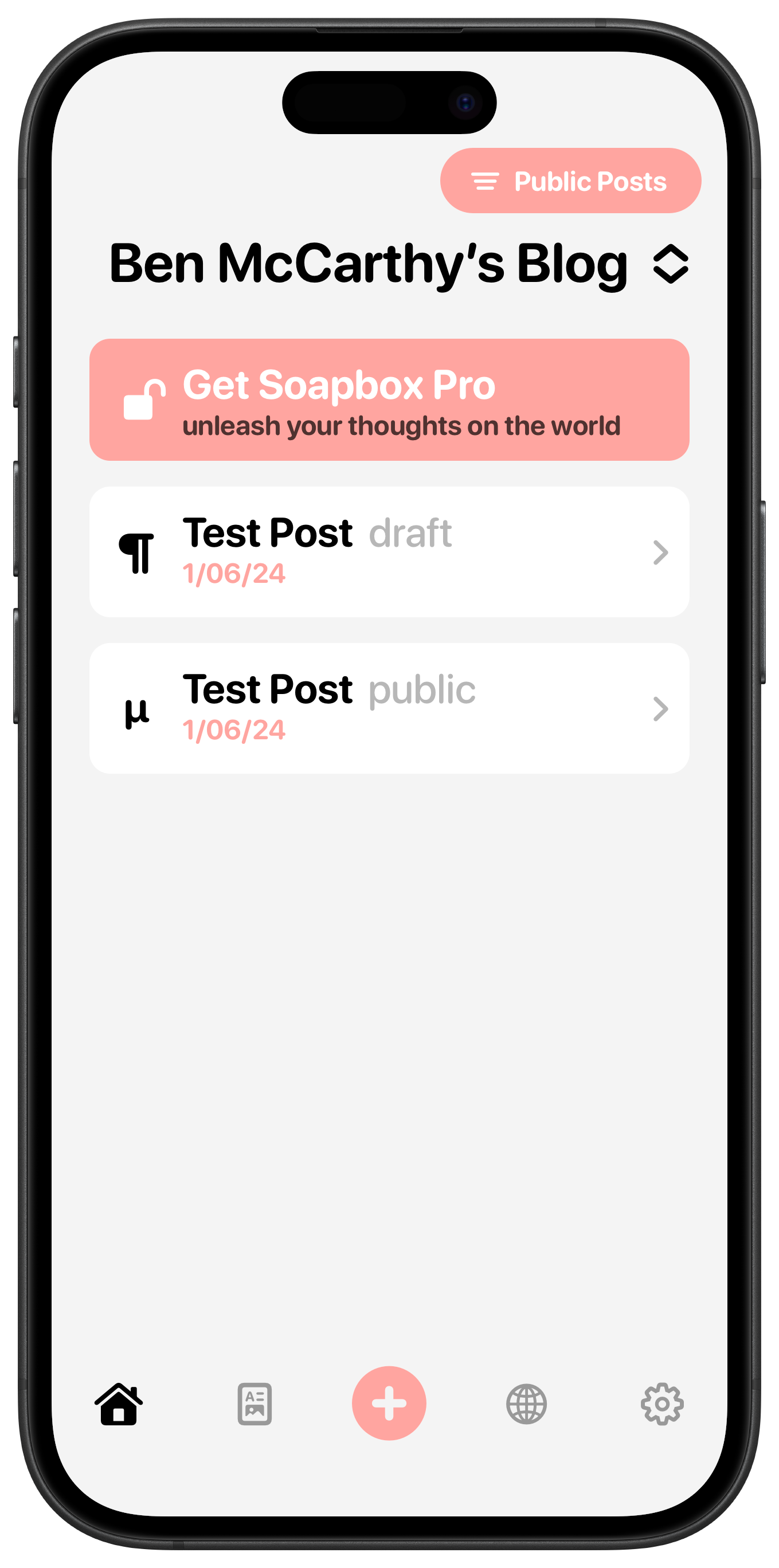
The original PupperPost and my redesign (and rebrand), Soapbox
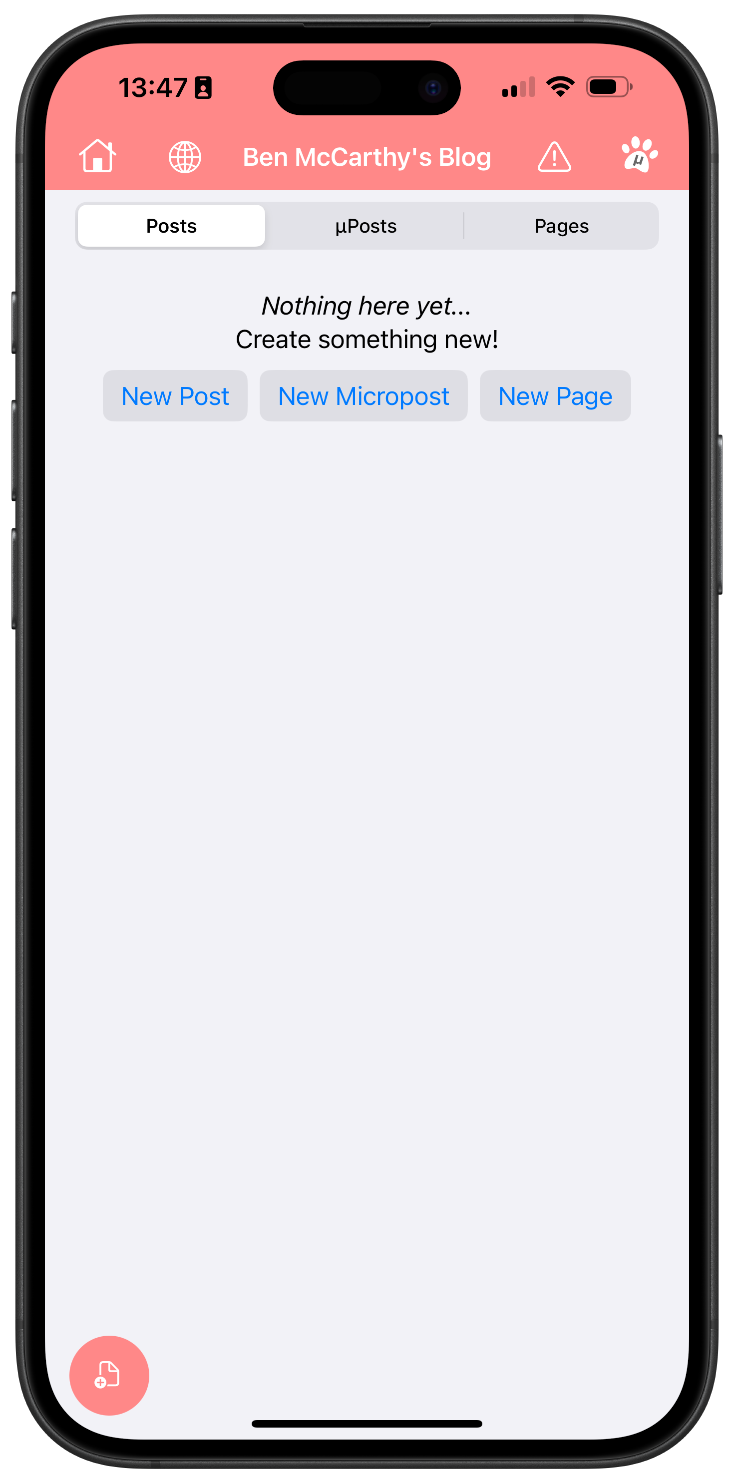
Aaron Vegh & Pupper Post
In May 2024, Aaron reached out to me for some design work on his blogging platform, PupperPost. I proposed a pretty major overhaul of the whole app, including changing the name to Soapbox. While my redesign never saw the light of day, I’m really proud of a lot of the work that went into it.
One of the features of PupperPost was that you could link it to your Mastodon account and your blog posts would automatically be linked to with a Mastodon post and you could post directly too. I thought that was very compelling and asked Aaron if he’d consider supporting any other social networks. That idea grew into creating a full fledged cross posting app, which I thought might be a more practical niche to target than the more competitive blogging space. Aaron was intrigued by the idea, but it wasn’t until I came back to him a little while later with some mockups that he was convinced.
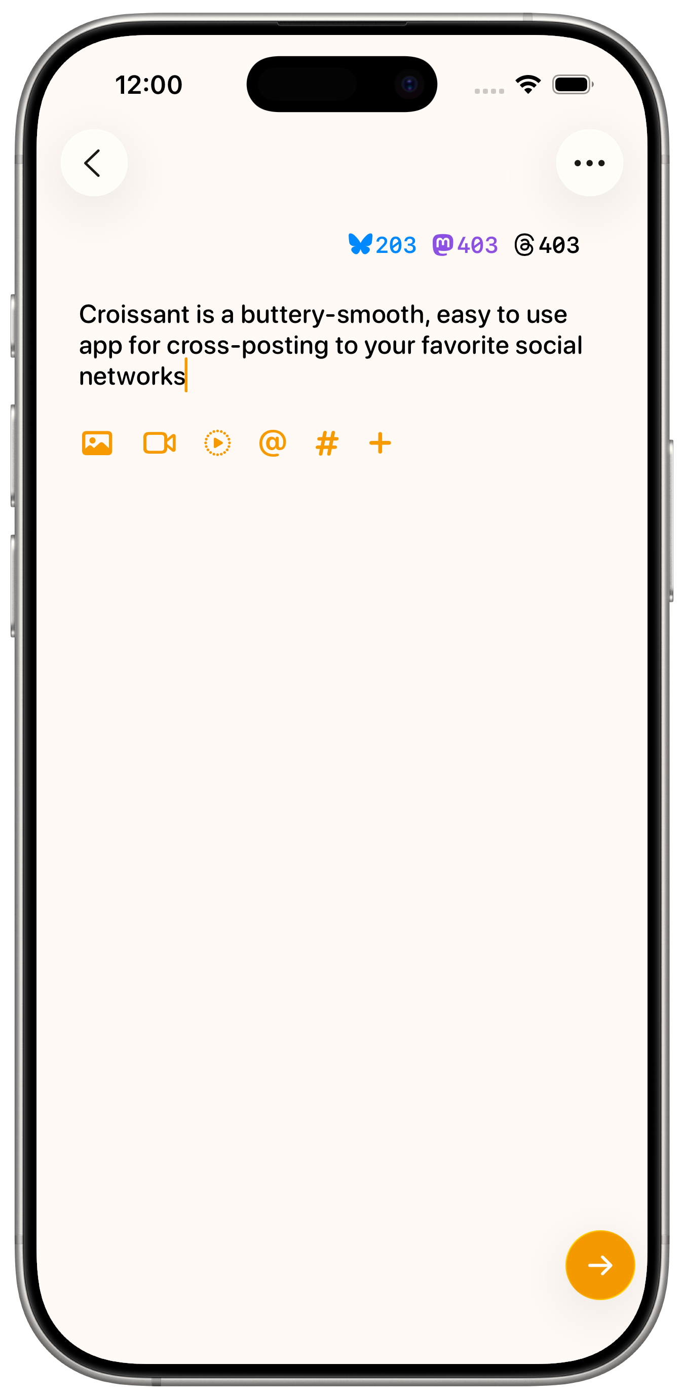
Croissant 1.0 and Croissant 2.0
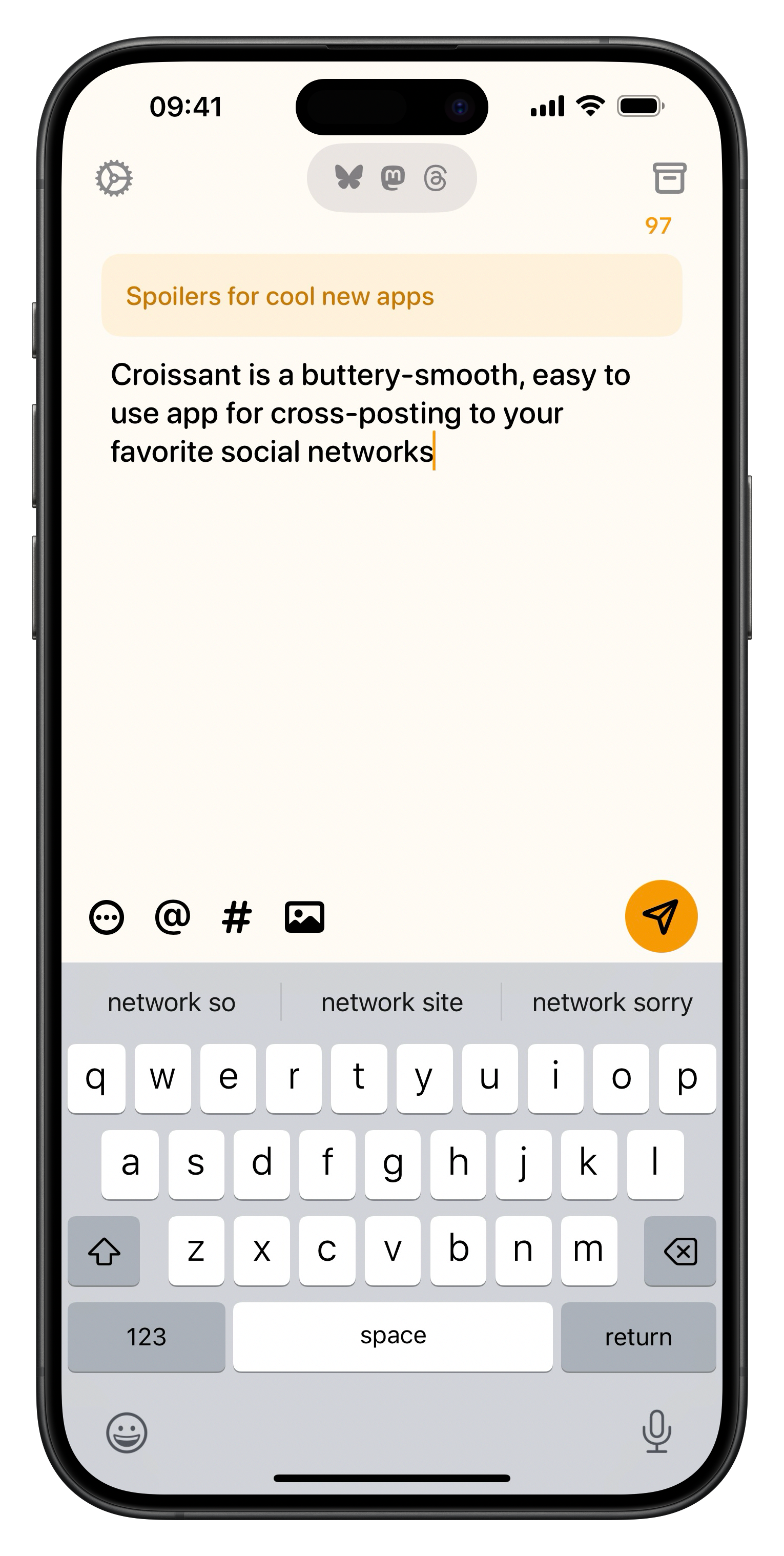
Croissant
If you’re reading this, then there’s a pretty good chance you’re already familiar with Croissant. Aaron and I launched it in late 2024 and we overhauled the design over summer 2025 for Liquid Glass. I’m not sure we ever would have had the confidence to start work on Indigo without having built Croissant first. Dealing with multiple accounts across multiple services presents a huge number of challenges, both technical and visual. Being able to take Croissant’s account sign in and management, as well as the Compose view gave us a big head start.
Indigo - Timeline and Toolbars
On the left is one of the earliest mockups of Indigo. You can see much of the current design is already there, including the tinted borders around avatars and the use image carousels instead of grids. The floating bars are present at the bottom and top of the screen. When Liquid Glass was announced, it killed me not to be able to show off these mockups.
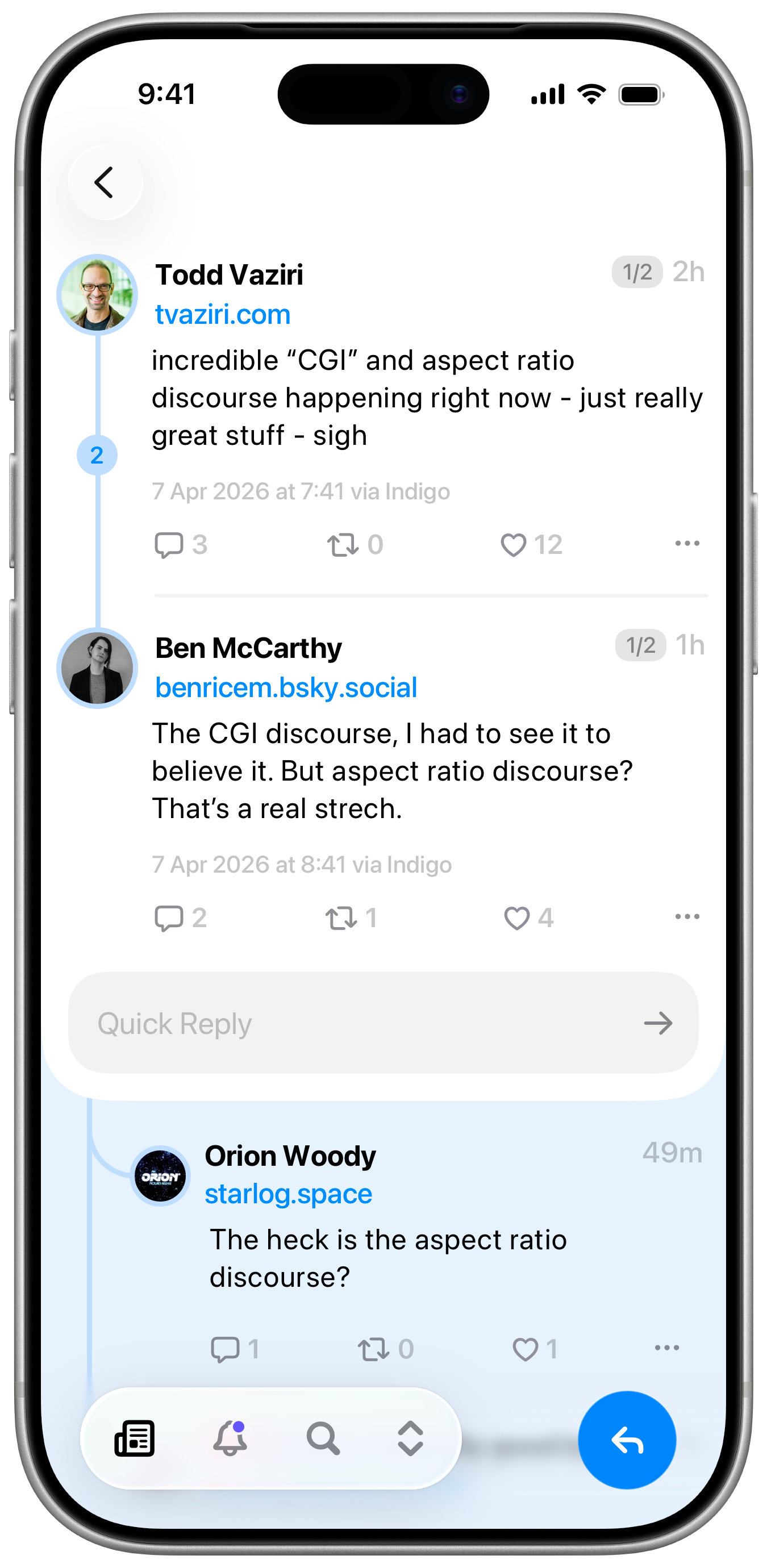
I also put a huge amount of effort into two aspects of Indigo’s navigation that we ended up throwing away, as they were now system defaults in iOS 26; rounded corners for views and “sloppy swiping” (you can start a backwards swipe from anywhere on screen, not just the leading edge). Somewhat inspired by the Dynamic Island, the top and bottom bars were designed to adapt to the current context, the bottom bar could become a quick reply field, the top bar would show profile info when looking at a single post and so on.
Ultimately, trying to work around the system navigation controller behaviours was proving a little too cumbersome, and iOS 26 came along and gave us about 80% of what we were trying to do for way less effort and with far more reliability. That said, I’m not a fan of Apple’s tab bars in iOS 26. I think they’re a little too cartoony, the use of colour is not great for legibility, and the liquid bubble effect is superfluous. I opted for a more subtle approach. At first I tried using the system toolbar to try and recreate a tab bar like experience, but this greatly reduced the amount of customisation and styling that could be applied, so it was quickly abandoned for a custom approach, heavily inspired by what the folks at Linear built for their iOS app.
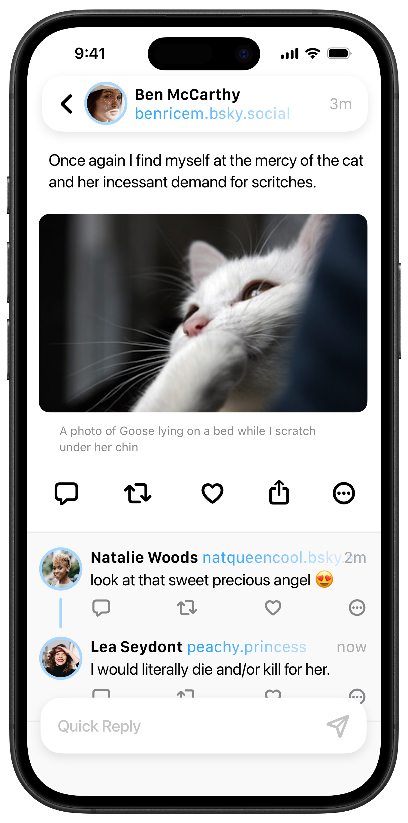
Early and current iterations of the Post Detail View
Indigo - Post Detail
The post detail view might be my favourite part of Indigo. You can see a lot of evolution here from the earliest mockup to the latest version. While it was nice having profile info in the top bar for single posts, there was no intuitive way to make it work for threads with multiple participants. So posts on the detail view shifted to be a little more like posts on the timeline, but with more.. detail.
Every decision here was made with the goal of maintaining focus on the thread that you came to see, providing more context, and less distraction. There’s a counter at the top, so you can immediately tell if you’re at the start, middle, or end of a long thread. Below the post, you can see the full timestamp (and on Mastodon, the name of the client app, if it‘s available) and a quick reply field which lets you fire off a text-only post without breaking your flow. Below the main section you’ll find replies to the last post in the thread. On the left of a thread is a ribbon with a counter for additional replies, and you can tap the ribbon to show those inline. This saves you from having to navigate through dozens of transitions to see everything. It’s a little unusual at first, but I think you’ll quickly grow to love it.
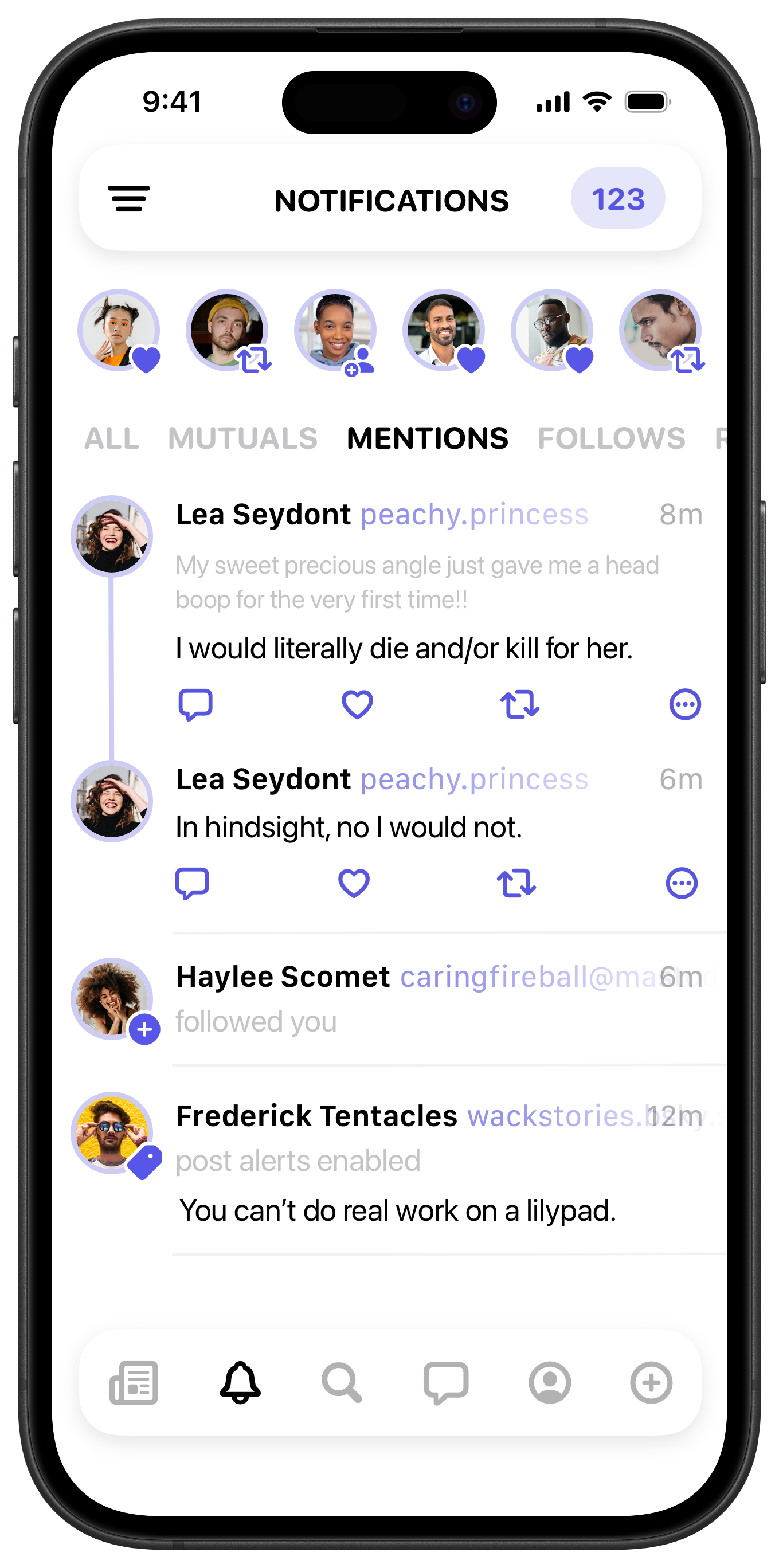
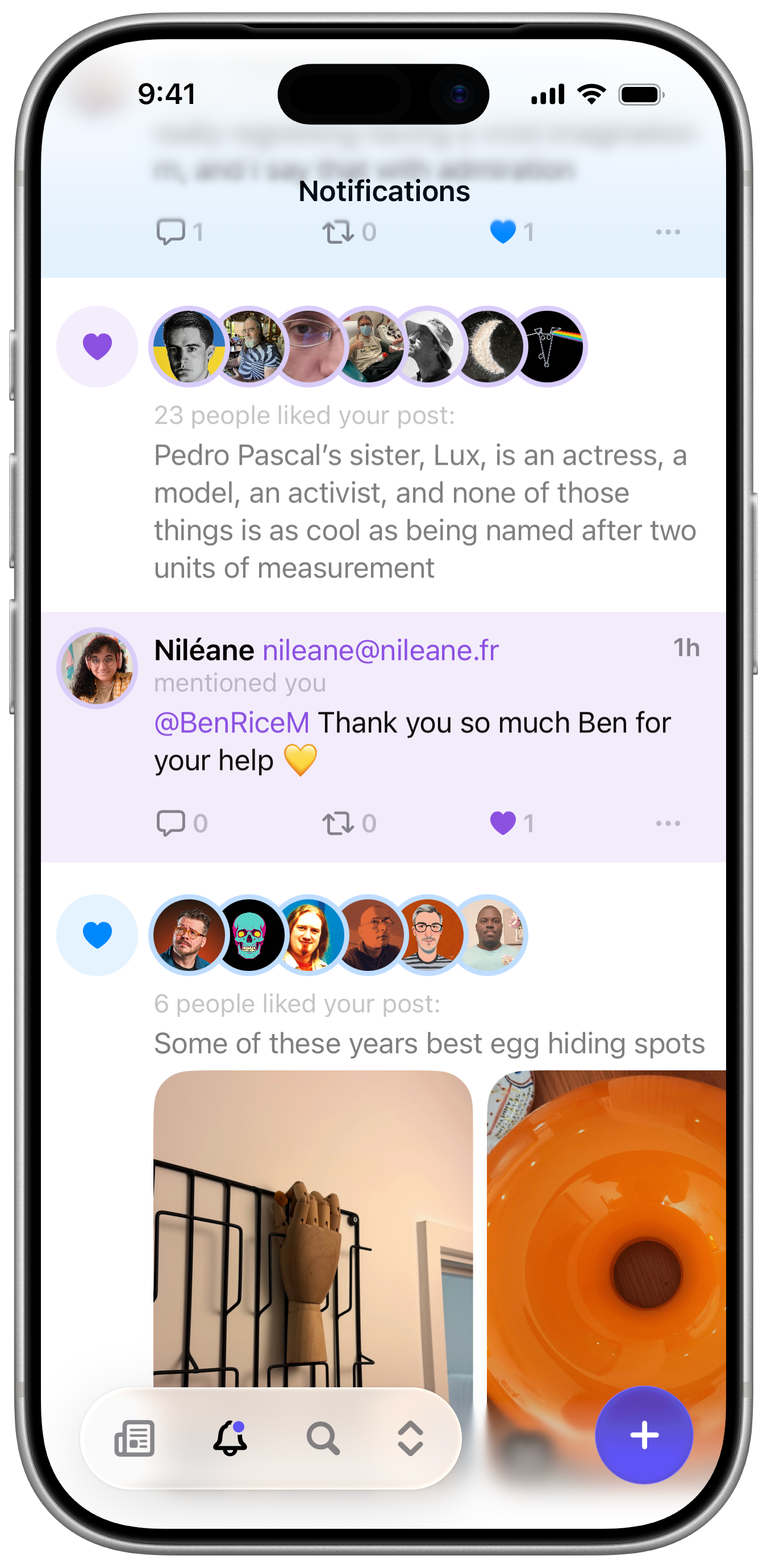
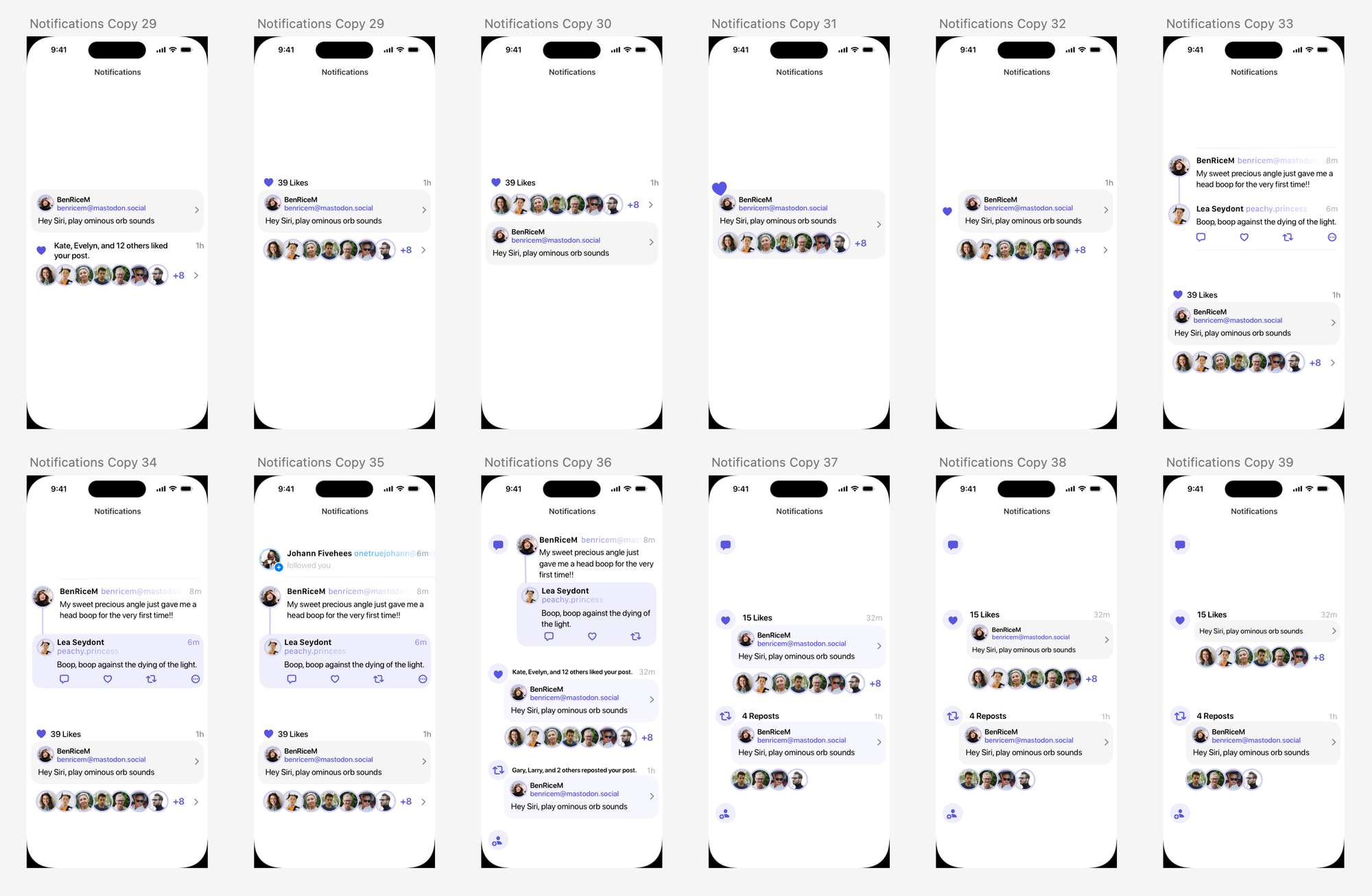
Early and current iterations of the Notifications View
Notifications
Notifications is one of those views that, for the most part, is exactly what you’d expect it to be. Some of the earlier designs included a summary of notifications at the top, but I don’t think it provided enough content to be really useful. There was a lot of iterating with much feedback from our beta testers to arrive at something that felt sufficiently clean and informative. Grouped notifications for likes and reposts help keep the list from getting too noisy. Replies, mentions and quotes are highlighted with a fill colour to stand out more (there was an intense debate about whether the fill should be edge to edge or not).
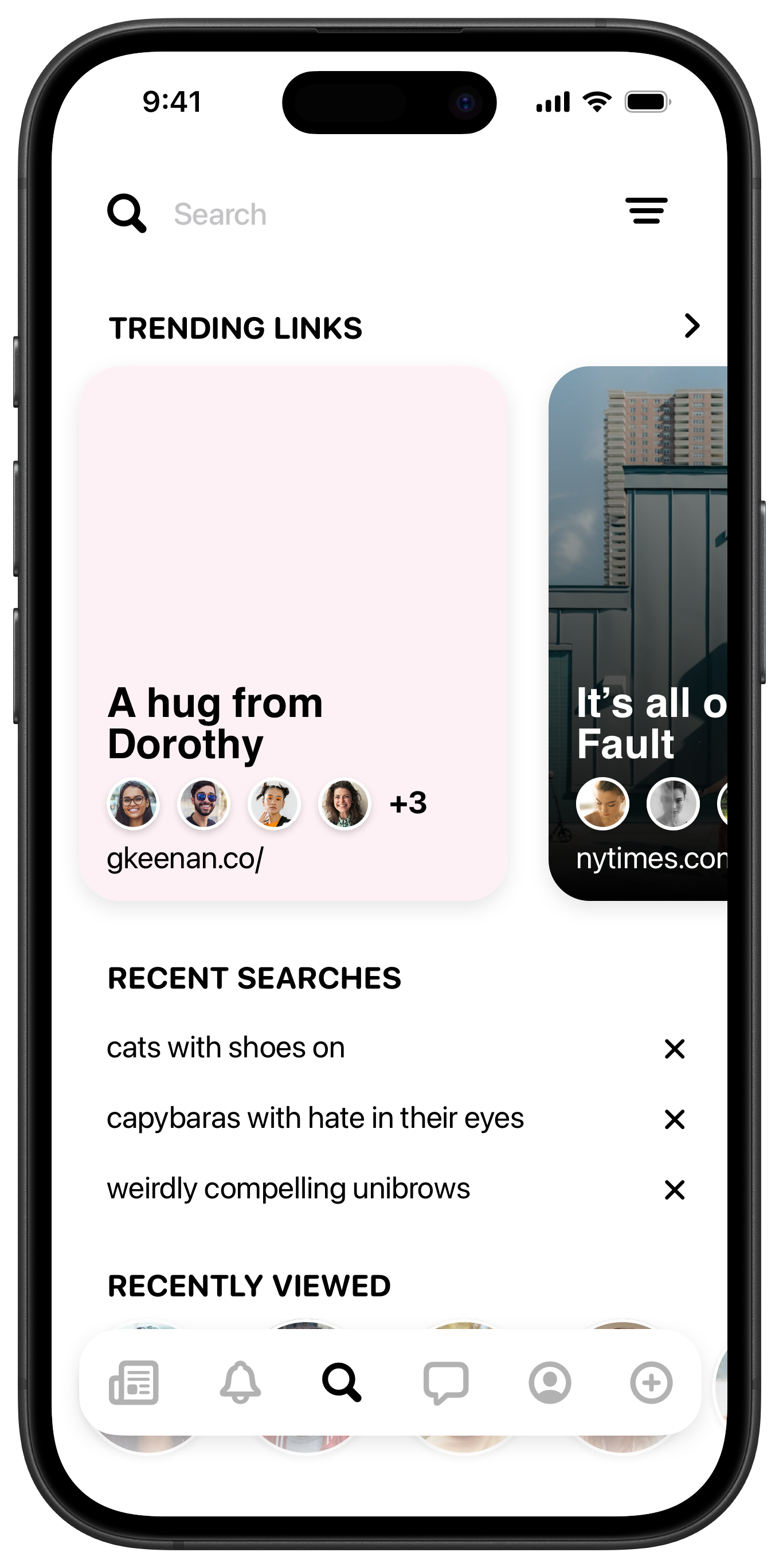
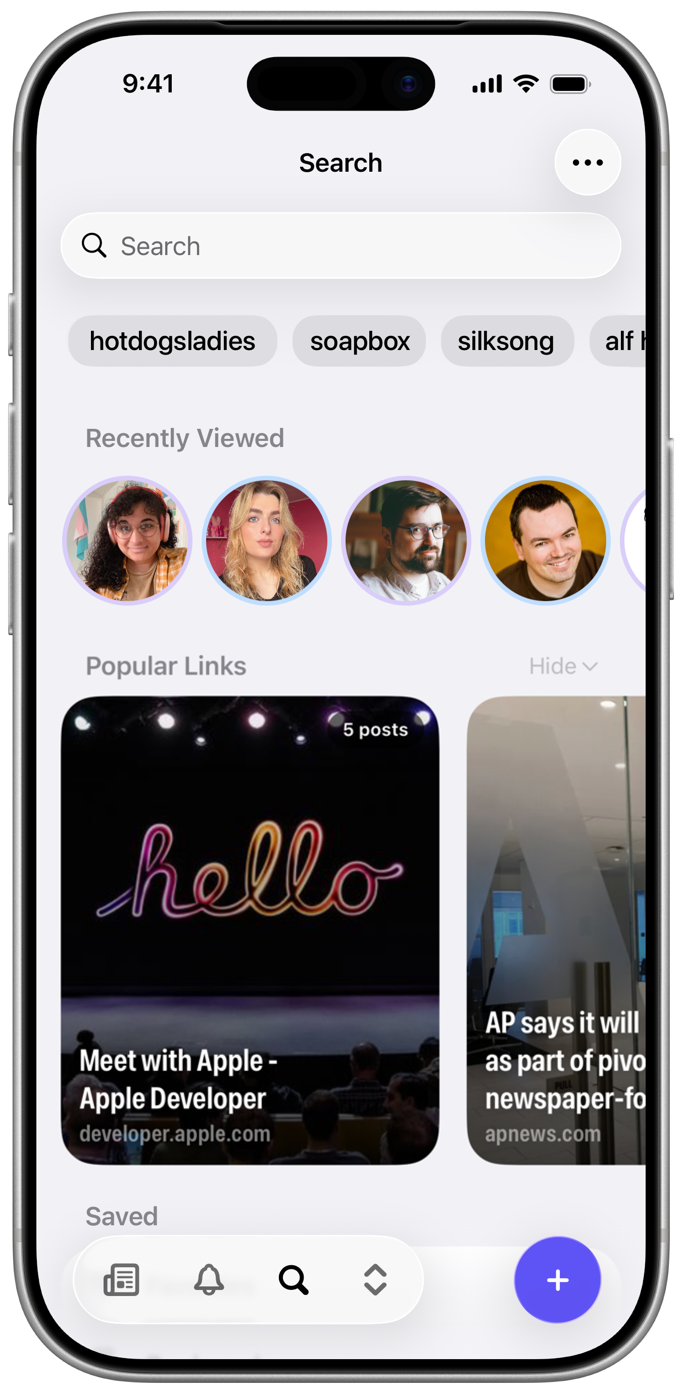
Early and current iterations of the Search View
Search
Search has remained pretty close to my original vision, which featured prominent cards for the links most shared by the people you follow. All the sections have been shuffled around quite a bit. The recent searches felt awkward at the top when they were listed vertically, as they pushed the more vibrant views downwards. But changing that section to scroll horizontally let it sit at the top without pushing everything too far down, and really brought everything together.
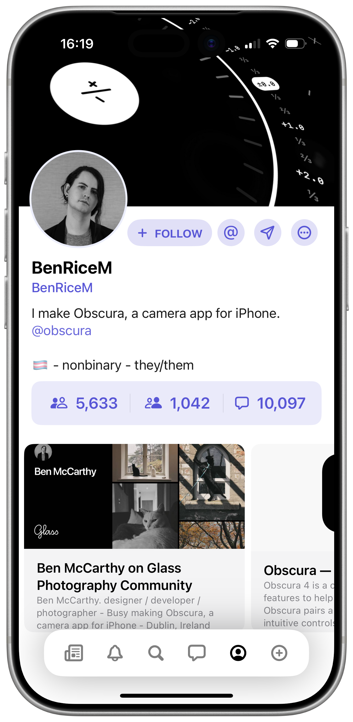
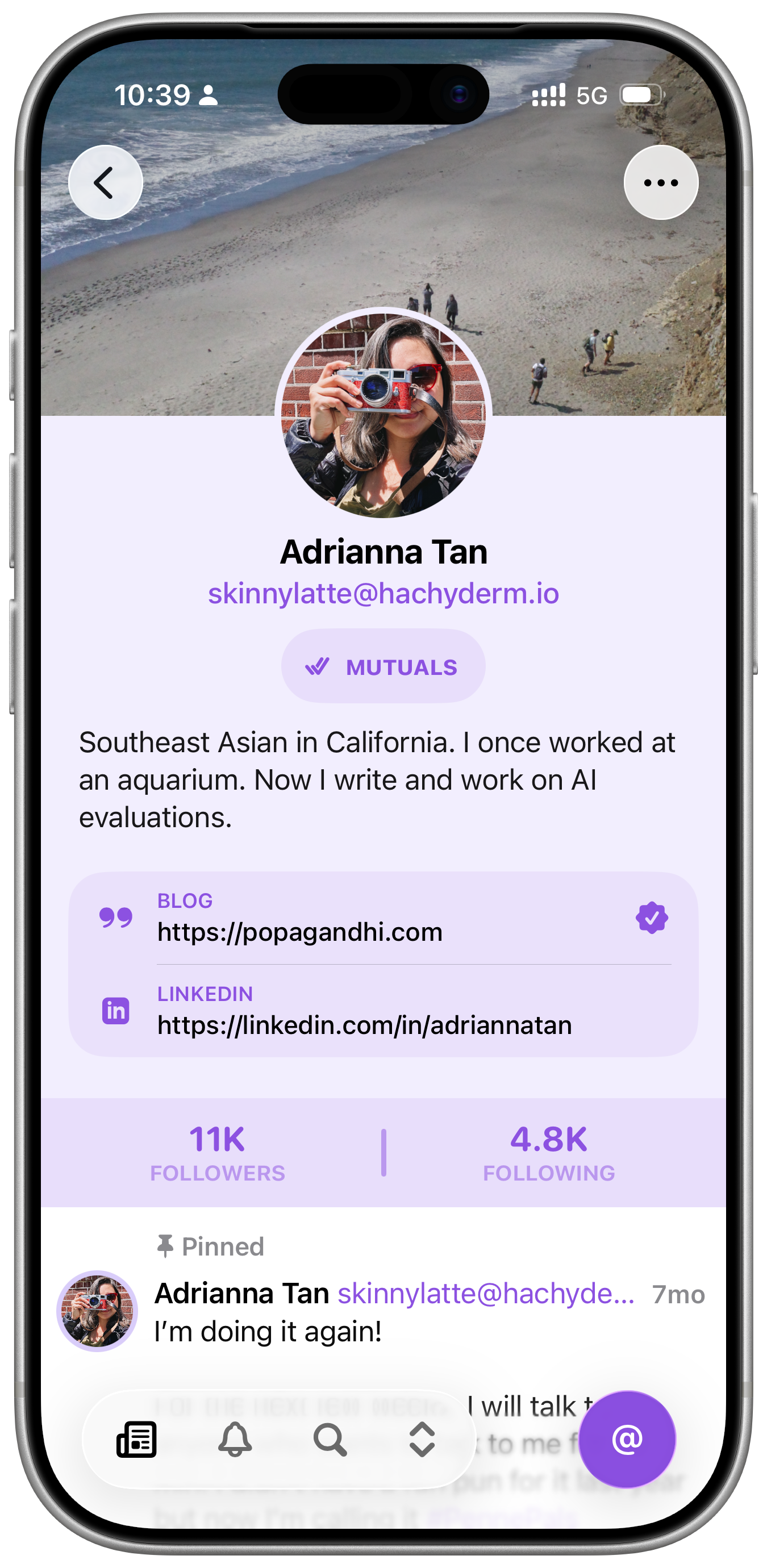
Early and current iterations of the Profile View
Profiles
I think the profile view is the part of the app I struggled with the most. There’s quite a bit of information and interactions to include and the information that might be most important to one person might be irrelevant to another. I toyed with a number of left aligned layouts to try and make more of the horizontal space, but they always fell apart quickly when larger dynamic type sizes were factored in. A lot of the early designs focused on merging profiles across both services, but we decided this was just too much complexity to deal with for 1.0. Frustrations aside, I’m quite happy with the profile fields on Mastodon, which I think both look nice, and the icons provided room for some fun easter eggs.
I hope this overview of Indigo’s design evolution has been at least a little bit interesting and informative. I know when I was starting out designing apps, I was hungry to see the process other designers went through, and I’m worried that in the age of AI, there won’t be much process left to share.
If you haven’t already, you should download Indigo. It’s free to try out if you just want to see how it looks and feels. It’s been an absolute joy to work on so far, and I can’t want to build more publicly now that it’s out in the world.
Be good to each other,
Ben