Obscura 4 - Highlights
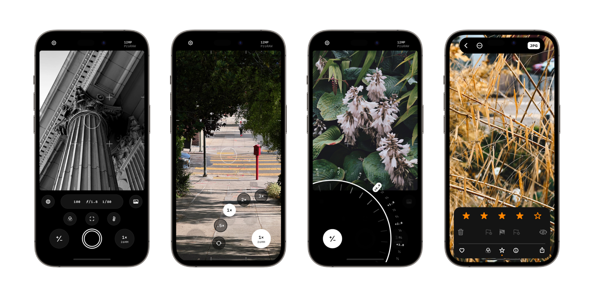
There are so many changes and improvements in Obscura 4, on top of many great features already in the app, and I wanted to call attention to some of my favourites.
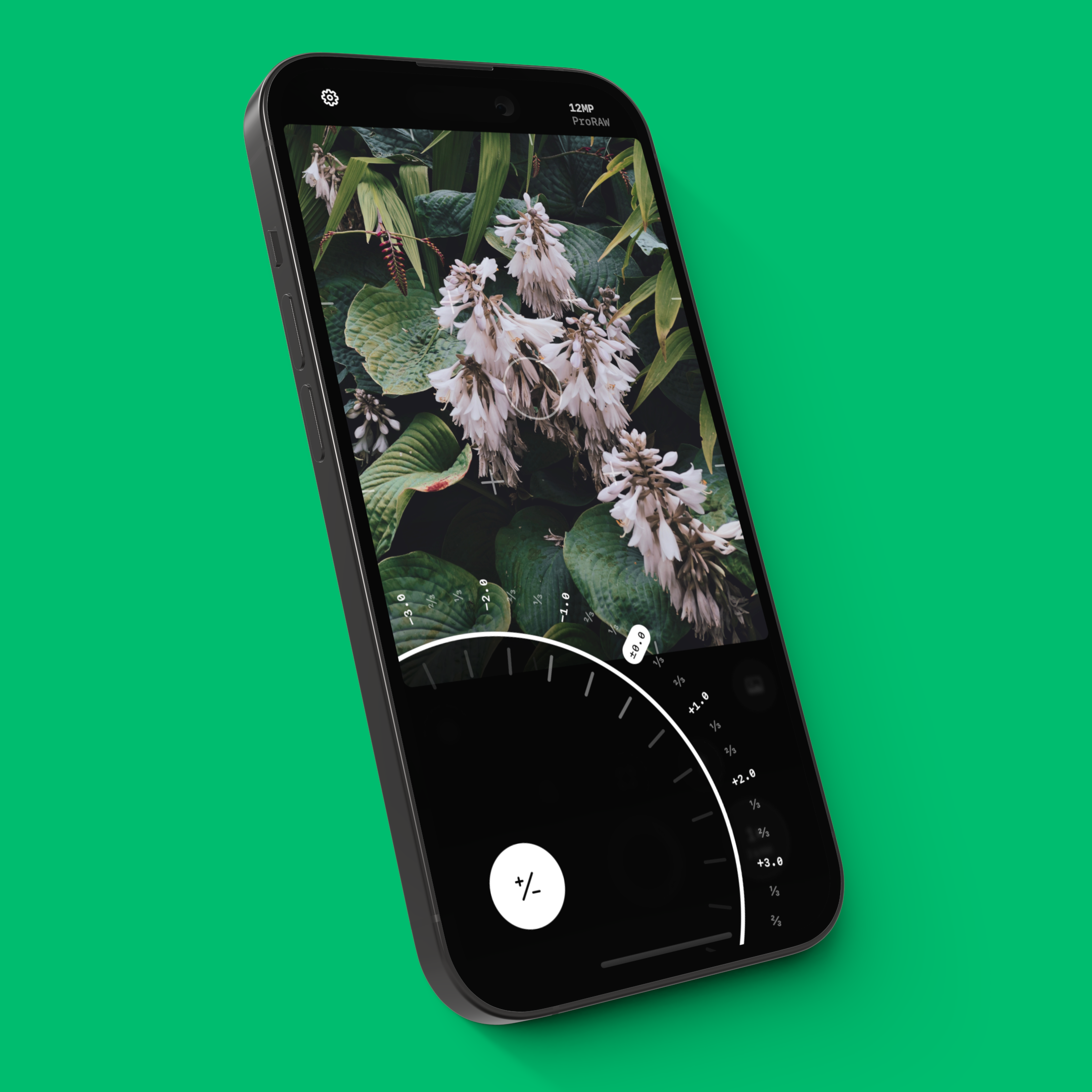
The Exposure Dial
When I show Obscura to someone, the first thing I get them to try is the Exposure Dial. Every time, I get to watch their eyes light up as they adjust the brightness and feel each increment of the dial as a haptic tap. It does so much to bridge the gap between smartphone and DSLR, and makes you feel in control, in the way a professional piece of equipment should.
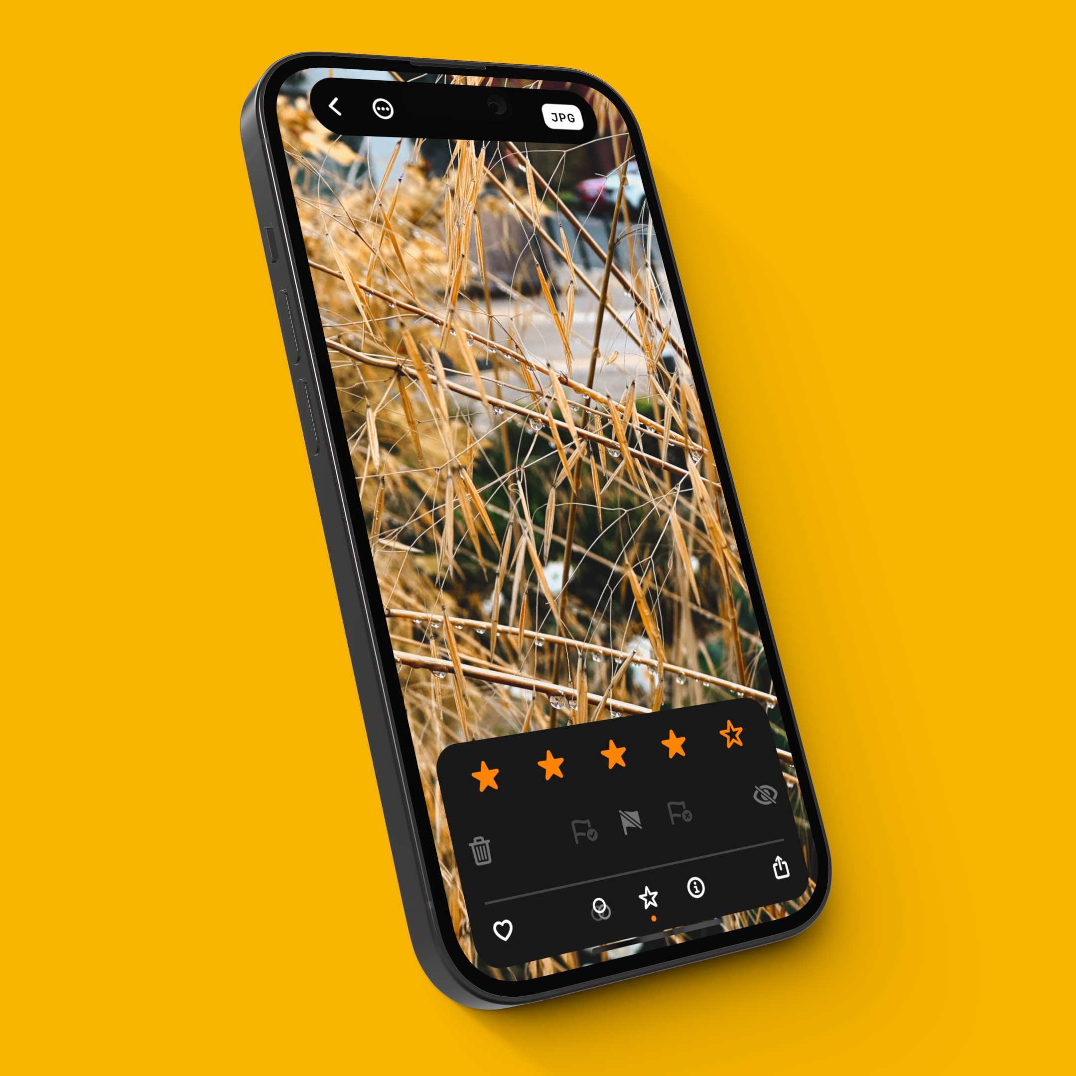
Image Detail Controls
This might be the bit of Obscura 4 that I’m most proud of. With a couple of clever little layout tricks, I adopted the standard modal card used throughout iOS to behave like a floating tab bar. When necessary it can expand to fill the screen, or float as a half sized card to show more detail, without obstructing the image being viewed.
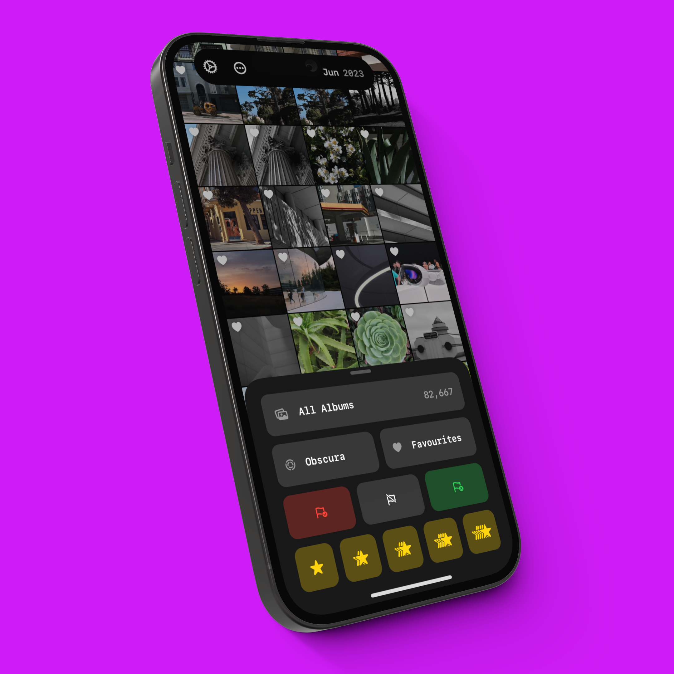
Album Picker
Obscura’s library interface went through a pretty major overhaul, both for simplicity and performance reasons. And part of that redesign was building a dedicated album picker. The new picker shows some of the most important collections right up top, with dedicated buttons for Obscura’s rating features, access to smart collection based on image type, and below all that are all your own albums, with sorting options to help you find what you need quickly.
Dual Reticules
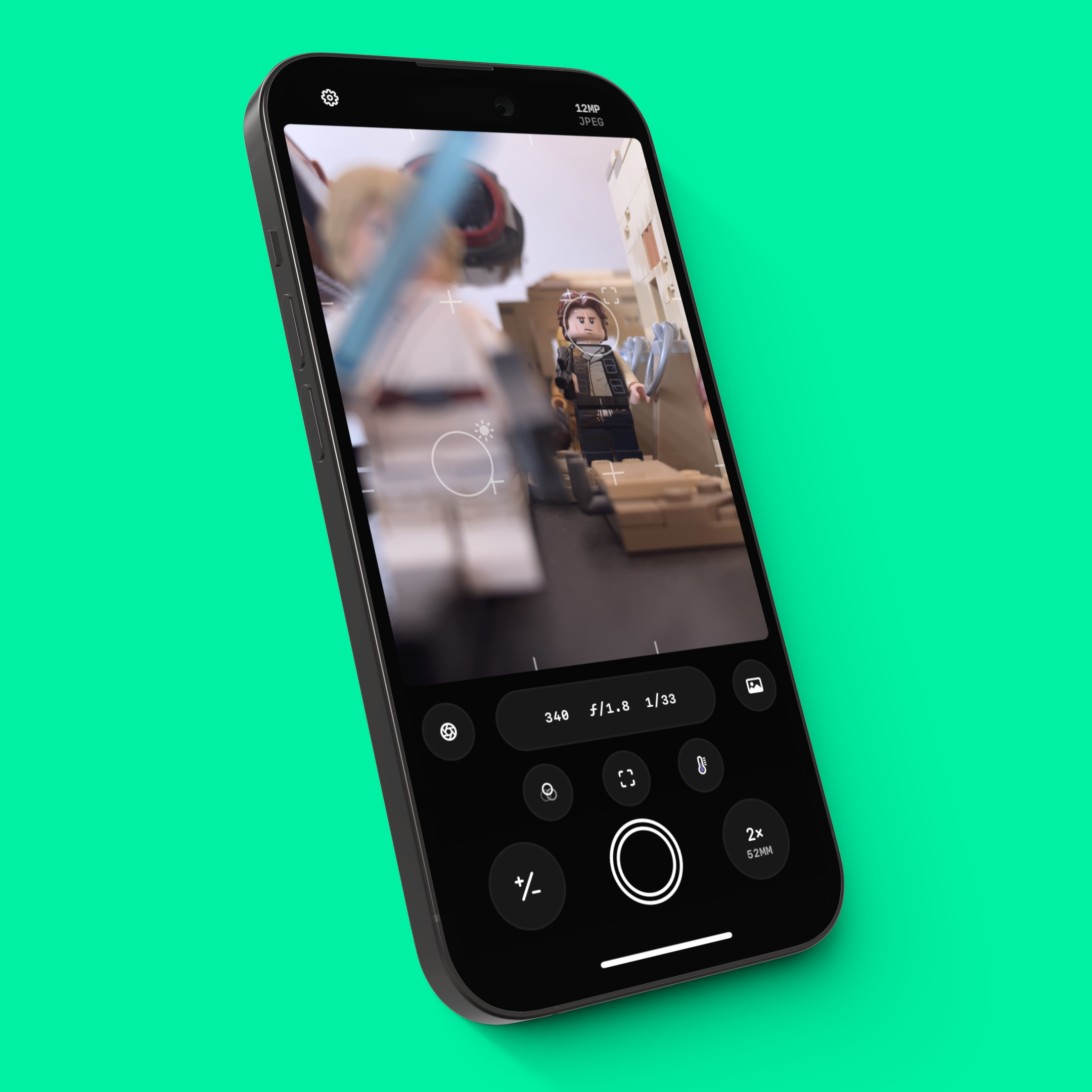
Obscura 4 now supports showing separate reticules for both focus and exposure points, Between the reticules, the grid, and the spirit level, there can be a lot happening over the viewfinder, so I put a lot of work into making sure that the layers all shared the same opacity, and that the reticules would mask any layers behind them, giving you a clearer view of your subject.
New App Icons
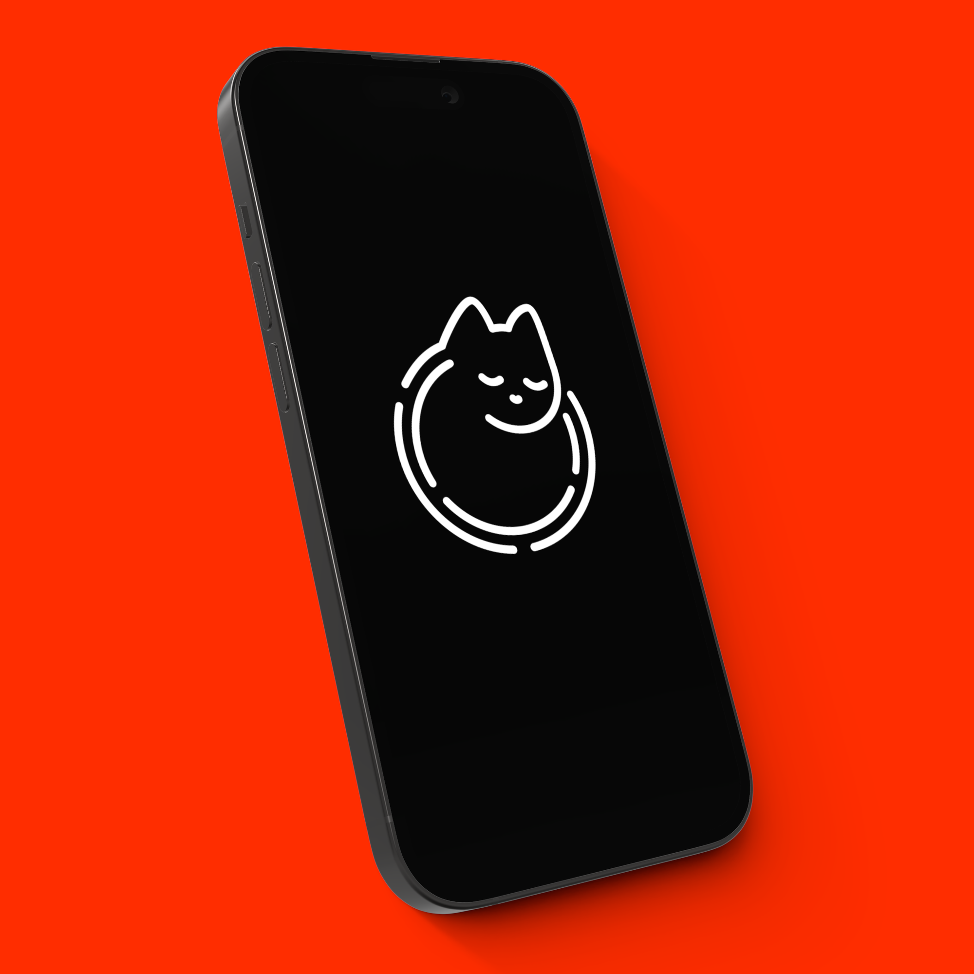
I was considering adding a more fun app icon to Obscura, maybe something with a little animal mascot, when I stumbled upon this icon, by Alina Oleynik, which I thought would work really well when blended with Obscura’s existing icon, and of course, it was inspired by my own cat, Goose.
There’s lots more that I’d love to share, but it would be even better if you downloaded Obscura and played around with it yourself, and let me know your favorite little detail. It would make my day.
Ben
